Bdeo · Design System · 8 min read
Ethos, a multi-client design system · Bdeo
210 components · almost every client on the same base
Case study by Vicente Molero, Senior Product Designer.
Overview
Bdeo · Design System
Ethos, Bdeo’s design system. Clients change the foundations, not the components.
Every insurer wanted to see its own brand in the product. For years, that meant a different product for each one. Ethos separates what changes per client, the foundations, from what never changes: the components and the rules that govern them.
In 30 seconds
In 30 seconds
- Problem
- There was no design system. The claims admin alone had 10 buttons in 7 styles and no rules, and every demanding client had its own version of the product.
- My role
- I proposed it and designed its architecture: foundations, components, principles and documentation. Engineering built it and the CTO sponsored it.
- Result
- Today almost every client has its brand applied on the same base of 210 components, and support applies it without going through design or engineering. The tech lead estimates development is about 40% faster.
- Role
- Senior Product Designer · system design and direction
- Duration
- Ongoing. It started with the claims dashboard redesign.
- Team
- Design (me), front-end engineering and support.
- Context
- Multi-tenant B2B platform for insurers in more than 30 countries. Every client applies its brand on the same base.
Impact
- 210 Components on the same base — 44 core components, 1,643 variants and 134 icons.
- Almost all Clients, with their brand on Ethos — Support applies each theme in code, without going through design or engineering.
- ~40% Faster development — The tech lead’s estimate. There’s no baseline measurement.
Every screen used to start from scratch. With Ethos we put a new feature together from pieces that are already tested, and it shows in our timelines.
The challenge
When I joined, there was no design system. There were per-project Figma files, some inherited from agencies, with no connection between them, and coded components nobody could reuse.
And every client asked for its own customization. If the client was demanding enough, it got one. So the product kept splintering: the same screen looked different depending on who opened it.
The button sums it up. The claims admin alone had 10 buttons in 7 different styles, and no rule for choosing between them. In Ethos there are 3 types (primary, secondary and destructive) and 4 states (default, hover, pressed and disabled). One system.
The cost never showed up on an invoice. It showed up as visual bugs, engineering rework and decisions made all over again on every screen.
Examples have been altered to protect client data.
Goals
Every problem from before became a goal for the system:
| Before Ethos | Goal |
|---|---|
| Every demanding client had its own version of the product | 1 · Multi-tenant: clients change the foundations, not the components |
| 10 buttons, 7 styles and no rules | 2 · Consistent: every component has its rule, and every rule has its principle |
| Nobody knew what to use or why | 3 · Self-explanatory: the system answers questions without asking design |
| Customizations that existed for a single client and nobody knew how to maintain | 4 · Scalable: support can apply a theme without design or engineering |
| Components with names only their author understood | 5 · Readable by AI: names and rules that both a new hire and an AI can understand |
Results
Goal 1 · Multi-tenant
The decision that defines Ethos is where you draw the line between the brand and the product. I drew it at the foundations.
What changes per client: color, typography, radii and the rest of the foundations. Each insurer has its own theme in code.
What never changes: the 210 components, their structure, their states and their rules. A claims table works the same for everyone; it just dresses differently.
Getting here meant settling something else first. Engineering proposed starting from a template or an existing design system: the fast route. I made the opposite case to the CTO. Bdeo was going to expand into new verticals, almost every client would need its own theme, and bending someone else’s system to that would force an architecture it was never built for. The CTO backed it, and Ethos became our own, multi-theme from the very first component.
The base foundations, each with its own scale:
- Typography. I didn’t choose it: I inherited it. Telegraf and Space Mono were already in Bdeo’s brand book, and there was no point reopening that debate. My job wasn’t to pick a typeface; it was to turn it into a system: 8 sizes, from 12/16 to 48/68, and 18 styles, each with a defined use, from headlines to technical data. Since every insurer brings its own, the font family changes per client. The scale, the hierarchy and the rhythm stay.
- Spacing: 11 steps, from 0 to 192 px. Few of them, with clear jumps, so nobody has to choose between 14 and 15.
- Radii and borders: 4 radii (0, 4, 8 and round), 2 weights and 3 border styles. Fewer options, fewer debates.
- Elevation: 5 levels, from no shadow to the highest one. A shadow tells you what sits on top of what; it isn’t decoration.
- Color: 169 variables in layers. Primitives hold the values; semantic tokens say what each one is for (background, text, state, brand). A component never uses a raw color, always its meaning. That’s why, when you switch clients, the primary button, the states and the brand gradient change all at once, without touching a single component.
Goal 2 · Consistent
Before the components, I wrote the principles: eight, in three groups. The creation principles say what product we want to build. The decision principles, how we decide as a team. The design principles, how each screen behaves.
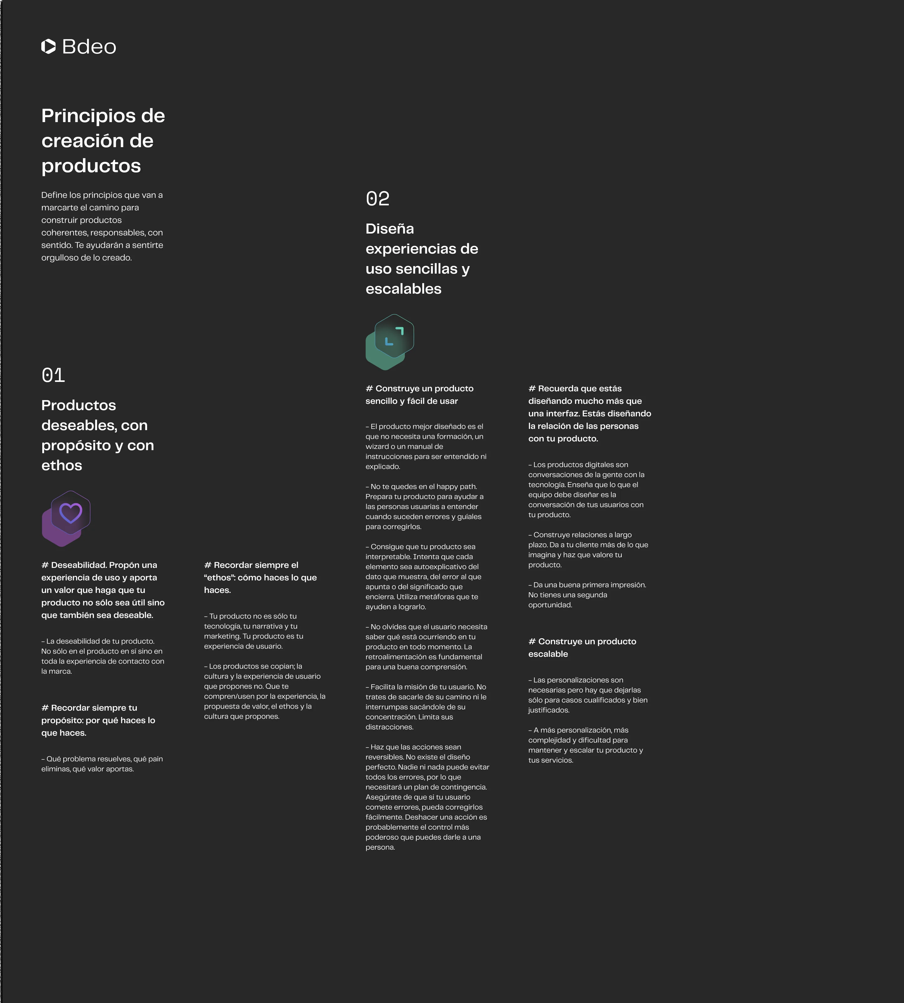
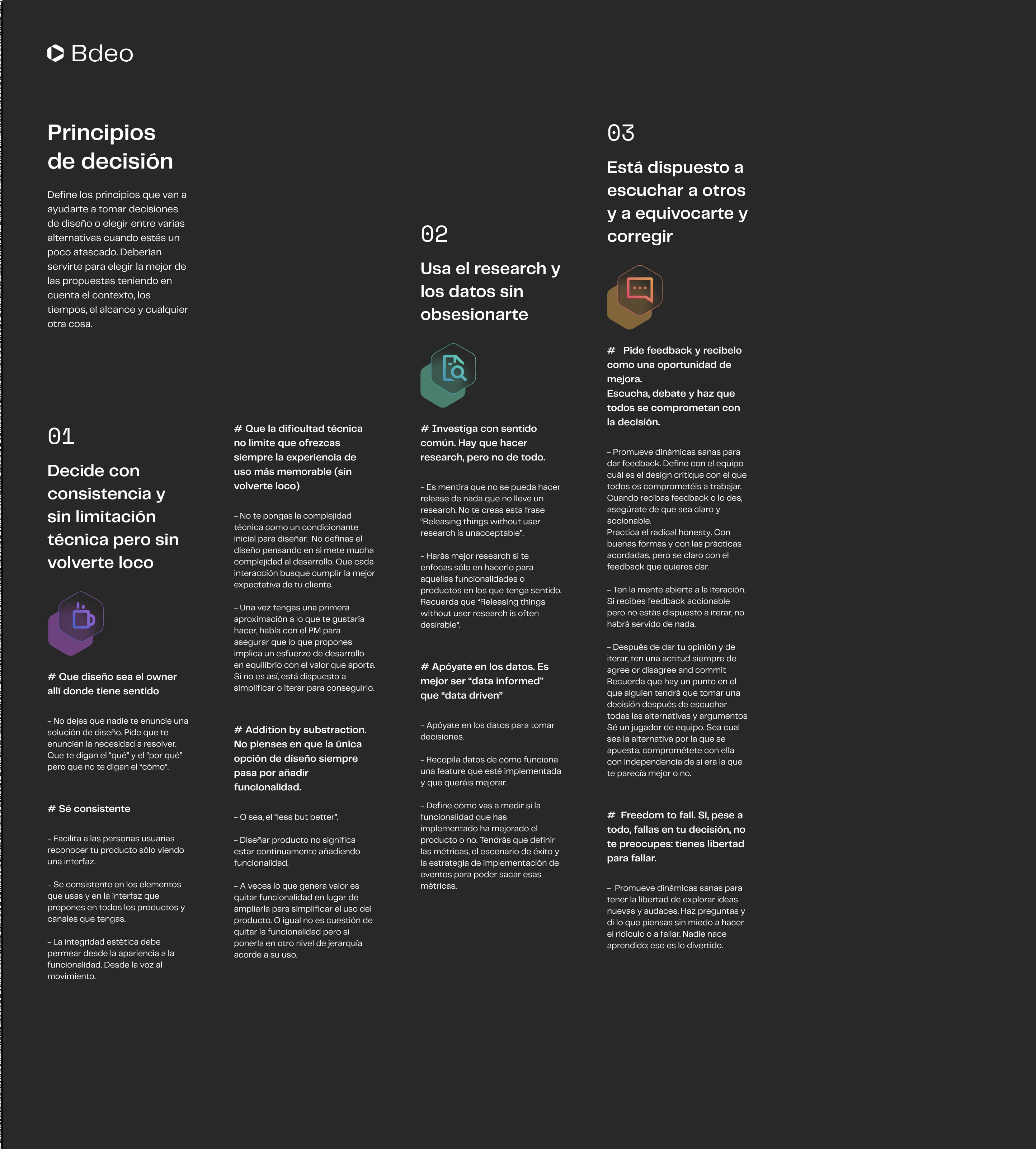
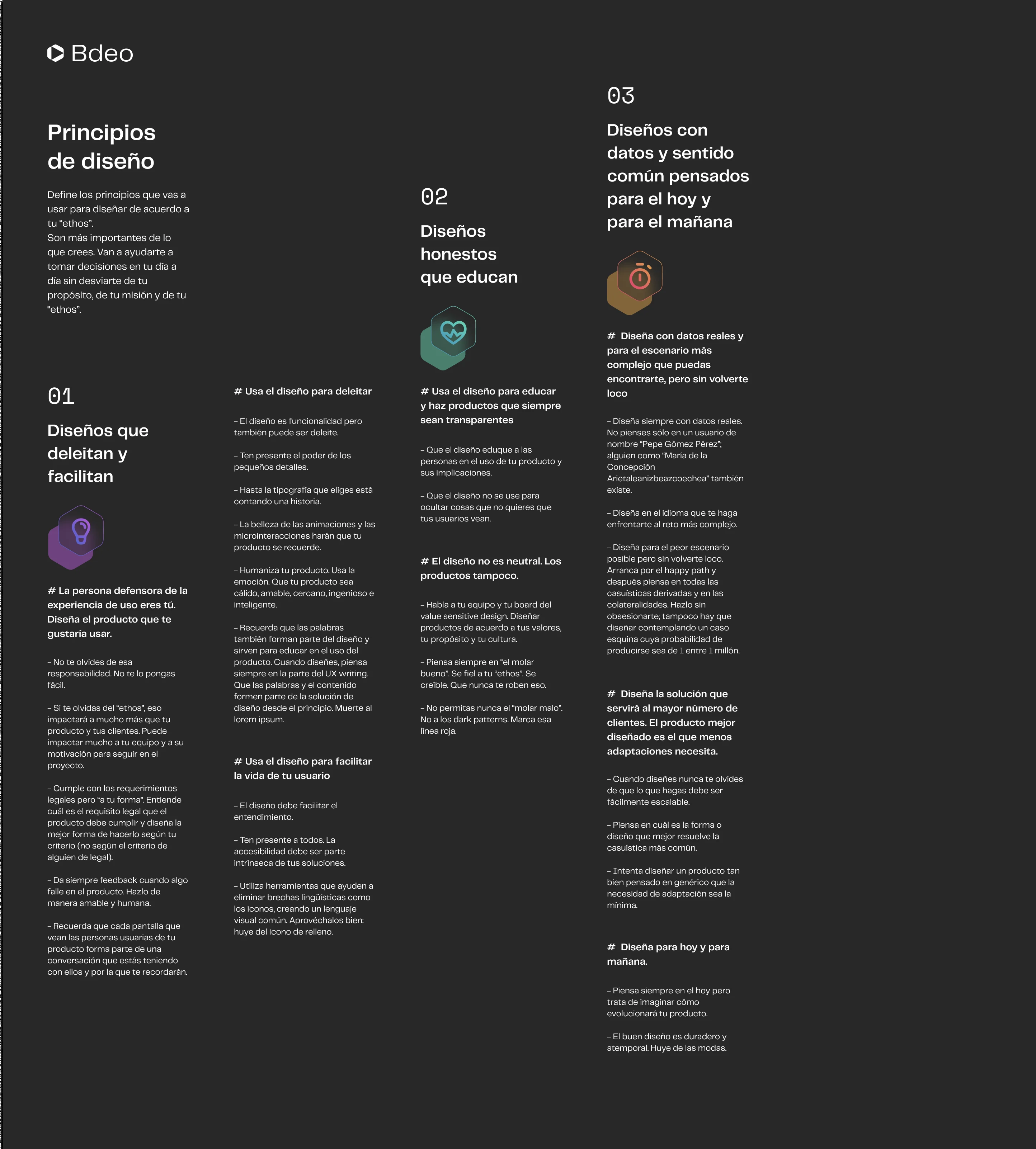
A principle is only useful if it decides something. That’s why every component rule comes from a written principle:
| Principle | What it says | Component rule | Where you see it |
|---|---|---|---|
| Design simple, scalable experiences | “Make your user’s mission easier. Limit their distractions.” | One primary action per view | Button, modal |
| Design simple, scalable experiences | “Make actions reversible.” | Destructive actions are confirmed | Destructive button, confirmation modal |
| Design simple, scalable experiences | “Users need to know what’s happening at all times.” | Loading keeps the shape | Skeleton, table |
| Designs that delight and make things easier | “Keep everyone in mind. Accessibility must be built in.” | Never color alone | States, pills |
| Decide consistently, without technical limits | “Addition by subtraction: less but better.” | 3 button types, not 10 | Button |
| Designs grounded in data and common sense | “The best-designed product is the one that needs the fewest adaptations.” | Clients change the foundations, not the components | Client themes |
When someone asks for an exception, the argument is with a written principle, not with the designer’s taste.
Goal 3 · Self-explanatory
Engineering needed components; documentation wasn’t their priority. I argued the opposite: a system’s value lies in the decisions it makes for you. The core components each have a usage and anatomy page in Figma, with the rule right at the top: when to use it, when not to, and why.
The system answers questions without anyone having to ask design.
Goal 4 · Scalable
Today Ethos has 44 core components, 210 published components and 1,643 variants. Almost every Bdeo client has its brand applied on that base, and each client’s theme is created and maintained by support, in code, without going through design or engineering.
What used to be one product per client is now one theme per client.
Goal 5 · Readable by AI
Ethos wasn’t built with AI in mind. I wrote the usage pages first, for people. It turned out they’re exactly what an AI needs: clear names, short rules and examples.
Today the tokens reach Claude Code and Cursor through the Figma MCP, and engineering builds in Cursor with the Storybook components. The latest prototypes we tested with users never went through Figma: we built them with AI directly on top of Ethos, so what we tested was already made from the real pieces. The next step is for PMs to be able to do the same.
To write this case study, I audited the system itself with AI through the MCP. That’s how I found some of the debt I describe below.
How we aligned
How we aligned
Ethos wasn’t decided by design alone. Every team had something at stake:
| Team | What worried them | How we solved it |
|---|---|---|
| CTO | Justifying the cost of building our own system | The benefits of scale and consistency. The CTO became its sponsor. |
| Engineering | Getting components fast, and the cost of complex ones like the table | Components for the common parts first; priorities set with the tech lead |
| Clients | Losing their brand identity | Their brand across all the foundations; our product in the components |
| Support | Depending on design and engineering for every new client | Themes in code that support applies on its own |
Trade-offs, debt and what I’d do differently
Every real system has debt. This is Ethos’s, and what I learned from each piece of it:
- The table: a battle I half lost. It’s Bdeo’s most complex component, where every claim gets worked. I wanted to turn it into a component; engineering preferred not to touch it, because any change is expensive. We agreed to componentize part of it, and later a rushed feature extended it outside the system. Today I’d fight that battle at the start: every month that goes by, the off-system variant gets more expensive to bring back.
- The button is 3 types and 4 states for whoever uses it, but 480 variants in Figma. They piled up as sizes, icons and states were combined. Simplifying how it’s built is next.
- Contrast in client themes is recommended, not enforced. Color belongs to each insurer. Today I’d enforce an AA minimum from the start.
- Smart Video still partly runs on its legacy. It’s being migrated piece by piece, when there’s a product reason, not all at once.
- I didn’t measure from day one. The impact rests on estimates. With a baseline for development time and variants per component, it would be a hard number.
- Customizations that touch the platform’s architecture stay outside the system, on purpose. The principles say so themselves: “Customizations are necessary, but they should be reserved for qualified, well-justified cases.”
My product role
I proposed Ethos and designed its architecture: foundations, components, principles and usage documentation. A colleague from support helped me with color at the start; the palette was already mostly defined. The engineering team built all of it, and the CTO sponsored it.
Today engineering and I maintain it together. Design proposes the changes and we prioritize them with the tech lead. Support creates and maintains each client’s themes.
Closing
Ethos is the set of traits and habits that define a group’s identity. That’s what I wanted the system to be: what every Bdeo product shares, whoever the client is.
A design system isn’t its components: it’s the decisions you never have to make again.